Understanding Statistical Control Charts
Statistical control charts are effective graphical tools that transform quality management by offering a visual framework for monitoring process performance and identifying normal versus abnormal variations. Developed by Walter A. Shewhart in the 1920s, these charts help businesses track process stability, catch potential issues early, and make data-driven decisions that improve operational efficiency.
Key Takeaways
- Statistical control charts help identify process variations by differentiating between common-cause and special-cause fluctuations.
- The charts typically include a central line, upper control limit, and lower control limit set at ±3 standard deviations.
- These tools are applicable across diverse industries, including manufacturing, healthcare, service sectors, and software development.
- Control charts support proactive quality management by enabling early detection of potential process issues.
- Implementing statistical control charts can lead to significant quality improvements and cost reductions.
Benefits of Control Charts
Control charts provide you with a clear picture of your process behavior over time. The central line represents the process average, while the upper and lower limits define the boundaries of expected variation. Any points falling outside these limits signal that something unusual may be affecting your process.
You’ll find these charts particularly valuable for continuous improvement efforts. By analyzing patterns in your data, you can quickly identify when adjustments are needed and verify if your improvement initiatives are actually working.
Choosing the Right Control Chart
Different control chart types suit specific data types. Variable data (measurements) work best with X-bar and R charts, while attribute data (counts) fit better with p, np, c, or u charts. Selecting the appropriate chart ensures accurate interpretation of your process performance.
Implementation and Impact
The implementation of statistical control charts delivers tangible benefits. Your organization can reduce defects, minimize waste, improve consistency, and boost customer satisfaction. These advantages translate directly to cost savings and enhanced competitive positioning in the quality management landscape.
“Statistical control charts are the compass of quality management, guiding businesses through the complexities of process variations while empowering them to proactively detect and address potential issues. By transforming raw data into insightful visuals, these charts not only enhance operational efficiency but also foster a culture of continuous improvement across diverse industries.”
Origins and Fundamental Concepts
Statistical control charts were pioneered by Walter A. Shewhart at Bell Laboratories during the 1920s. His groundbreaking work established these charts as essential graphical tools for monitoring process performance and maintaining quality standards. These statistical control charts revolutionized how businesses approach quality management by providing a visual framework to distinguish between normal variations (common-cause) and abnormal fluctuations (special-cause) in processes.
At the core of statistical control charts are three fundamental elements:
- Central Line (CL): Represents the process mean or average performance
- Upper Control Limit (UCL): Typically set at +3 standard deviations from the mean
- Lower Control Limit (LCL): Typically set at -3 standard deviations from the mean
When a process operates within statistical control, approximately 99.73% of all data points will fall within these control limits. This statistical foundation gives you confidence that your process is stable and predictable. Any points outside these limits signal potential special causes requiring investigation. Statistical control charts help you identify when to take action and when to leave a process alone, preventing costly post-hoc management decisions that often occur without proper data analysis.
Core Components and Applications
Statistical control charts serve multiple essential functions in your quality management system:
- Process stability monitoring
- Early detection of abnormal variations
- Prevention of defects before they occur
- Support for data-driven decision making
- Historical performance documentation
You’ll find statistical control charts particularly valuable when implementing continuous improvement initiatives as they provide objective evidence of process changes. The statistical foundation of these charts gives you reliable indicators of whether improvements are genuine or simply random variations.
The application of statistical control charts extends across diverse industries:
- Manufacturing: Monitoring product dimensions and weights
- Healthcare: Tracking patient outcomes and medication errors
- Service sectors: Measuring customer satisfaction and response times
- Software development: Analyzing defect rates and development cycles
This versatility makes statistical control charts an indispensable tool for quality professionals across virtually every sector. By implementing statistical control charts in your operations, you’ll gain insights that transform how you manage processes, reduce waste, and deliver consistent quality to customers.
Organizations that master process management can reduce their defects by as much as 90%, demonstrating the power of statistical tools like control charts in achieving remarkable quality improvements.
hbr.org
Understanding Control Chart Types and Data Analysis
Control charts are essential tools in statistical process control (SPC) that help you monitor and improve quality. Statistical control charts revolutionize how you manage process variations by providing a visual framework to distinguish between normal and abnormal fluctuations.
There are two primary categories of control charts you should understand when implementing quality control initiatives:
- Variable Control Charts: These track continuous, measurable data like temperature, weight, or dimensions. They’re ideal when you need precise measurements and can collect quantitative data.
- Attribute Control Charts: These monitor discrete, countable data such as defect percentages or pass/fail results. They’re useful when dealing with qualitative assessments.
Comprehensive Control Chart Types
Each statistical control chart serves a specific purpose in your quality management system:
- X-bar Charts: Monitor sample means to track the central tendency of your process over time.
- R Charts: Assess subgroup variability to understand the consistency of your process.
- p Charts: Track percentages of defective items in varying sample sizes.
- Individual X Charts: Analyze single observations when grouping data isn’t practical.
When selecting the appropriate statistical control chart for your process, consider these critical factors:
| Chart Type | Data Type | Sample Size | Application Example |
|---|---|---|---|
| X-bar & R Charts | Variable | 2-10 per subgroup | Monitoring product dimensions |
| p Chart | Attribute | Varying sample sizes | Tracking defect percentages |
| Individual X | Variable | Individual measurements | Monitoring infrequent processes |
Effective implementation of statistical control charts requires understanding statistical rules for variation detection. When points fall outside control limits (typically set at ±3 standard deviations), it signals potential special causes that require investigation. This approach allows you to make data-driven project integration decisions rather than reacting to normal process fluctuations.
Many organizations implement statistical control charts using specialized software like Minitab or JMP, while others integrate them with their continuous improvement frameworks. The flexibility of statistical control charts makes them valuable across industries—from manufacturing to healthcare and service sectors.
By mastering statistical control charts, you’ll develop a deeper understanding of your processes, enabling more effective quality management and problem-solving capabilities. This statistical approach transforms quality control from reactive inspection to proactive prevention, ultimately reducing costs and improving customer satisfaction.

Process Monitoring and Quality Management Strategies
Statistical control charts serve as vital tools to detect process instability and prevent defects before they occur. You’ll find these charts at the heart of modern quality control, helping businesses make data-driven decisions instead of relying on gut feeling. Statistical control charts provide the visual framework to distinguish between normal variations and problematic outliers in your processes.
When implementing statistical control charts for quality management, you need to understand how to identify warning signs. These include points falling outside control limits, non-random patterns in your data, and statistical rules that detect unusual variation. These indicators help you spot problems early, saving time and resources.
Here are the primary ways statistical control charts enhance your quality management:
- Early detection of process shifts before defects occur
- Clear visual representation of process performance over time
- Differentiation between random variation and actionable issues
- Quantifiable metrics to assess process improvement efforts
- Consistent framework for operational decision-making
The right implementation tools make statistical control charts more accessible. Software options like Minitab and JMP offer comprehensive analysis capabilities, while database analytics tools can integrate these charts into your existing systems. For budget-conscious teams, open-source platforms like R provide powerful alternatives.
Choosing the Right Chart for Your Process
Selecting the appropriate statistical control chart depends on your data type and monitoring needs. The table below summarizes common chart types and their applications:
| Chart Type | Data Type | Best Used For | Key Benefit |
|---|---|---|---|
| X-bar Chart | Variable | Sample means | Monitors central tendency |
| R Chart | Variable | Sample ranges | Tracks process variability |
| p Chart | Attribute | Defect percentages | Monitors quality rates |
| Individual X | Variable | Single measurements | Works with limited samples |
When implementing these charts, you’ll want to avoid common pitfalls that can undermine their effectiveness. Management mistakes to avoid include using improper sample sizes, misinterpreting statistical signals, and failing to take action when patterns emerge.
Statistical control charts don’t just identify problems—they provide the foundation for continuous improvement. By establishing a baseline of normal process behavior, you can measure the impact of changes and refinements. This creates a cycle of ongoing enhancement that drives long-term quality improvements and cost reductions across your operations.
Expert Insight: To effectively implement process monitoring and quality management strategies using statistical control charts, prioritize early detection of process shifts by establishing clear control limits and recognizing warning signs like non-random patterns. Utilize the appropriate chart type—such as X-bar for sample means or p-chart for defect percentages—based on the specific data and monitoring needs of your operation. Ensure continuous improvement by measuring the impact of adjustments and integrating statistical tools with existing systems to foster data-driven decision-making that enhances quality and efficiency.
Cross-Industry Applications and Impact
Statistical control charts have transformed quality management across diverse industries. You’ll find these powerful monitoring tools delivering measurable improvements in sectors far beyond their manufacturing origins. The versatility of statistical control charts makes them essential for any organization focused on process optimization and quality enhancement.
In manufacturing, control charts track product dimensions and reduce defect rates by providing early warning signals when processes drift from acceptable parameters. By implementing statistical control charts, you can monitor critical production metrics in real-time, preventing costly quality issues before they escalate into major problems.
Healthcare organizations utilize statistical data analytics to standardize test results and track patient outcomes. These charts help medical facilities identify unusual patterns in treatment effectiveness, infection rates, and procedural success. Statistical control charts have become particularly valuable for hospitals looking to maintain consistent quality standards across multiple departments.
The service sector harnesses statistical control charts to measure customer satisfaction and operational efficiency. Call centers track metrics like response times and resolution rates, while hospitality businesses monitor guest satisfaction scores. By applying statistical control analysis to these metrics, you can quickly identify service breakdowns and implement targeted improvements.
Key Performance Indicators Across Industries
Different industries leverage statistical control charts to monitor specific performance indicators. Here’s how various sectors apply these tools:
- Manufacturing: Production cycle time, equipment downtime, first-pass yield rates
- Healthcare: Medication error rates, patient wait times, readmission percentages
- Financial Services: Transaction processing times, error rates, compliance deviations
- Software Development: Bug discovery rates, code quality metrics, deployment success
Software development teams have embraced statistical control charts for monitoring error rates and optimizing development processes. These charts help development teams establish predictable performance standards and identify when coding or testing processes need adjustment. Implementing continuous improvement methodologies becomes more effective when backed by statistical control data.
The impact of statistical control charts extends to cost reduction strategies across all these industries. By minimizing variation and preventing defects, organizations reduce waste, rework, and customer complaints. Statistical control charts provide the data foundation needed to make informed decisions about process improvements, resource allocation, and quality initiatives.
When properly implemented, statistical control charts transform operational oversight from reactive problem-solving to proactive process management. This shift in approach delivers substantial improvements in quality, efficiency, and customer satisfaction across virtually any industry where consistent performance matters.
Implementing statistical process control in your operations can lead to quality improvements exceeding 30%, depending on the industry and processes involved.
hbr.org
Statistical Interpretation and Advanced Techniques
Understanding statistical control charts requires knowledge of both basic and advanced analytical methods. You’ll need to master several interpretation techniques to effectively use these powerful quality control tools.
Variation Analysis Fundamentals
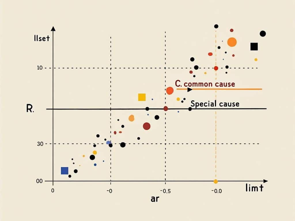
Control charts help you distinguish between common cause and special cause variation. Common cause variation represents the natural, expected fluctuations in your process, while special cause variation signals abnormal patterns that need investigation. When analyzing statistical control charts, look for these telltale patterns:
- Points beyond control limits (±3 standard deviations)
- Runs of 7+ consecutive points on one side of the centerline
- Trends of 6+ points consistently increasing or decreasing
- 2 out of 3 consecutive points in the outer third of the control limits
- Unusual or non-random patterns that suggest process instability
Advanced analysis techniques go beyond basic pattern recognition. You can enhance your process optimization methods by incorporating these statistical approaches:
| Technique | Application | Benefit |
|---|---|---|
| Process Capability Analysis | Measures process ability to meet specifications | Quantifies potential for defects |
| CUSUM Charts | Detects small, persistent shifts in process mean | Earlier detection than traditional charts |
| EWMA Charts | Uses weighted averages to increase sensitivity | Better for processes with autocorrelation |
| Multivariate Control Charts | Monitors multiple related variables simultaneously | Identifies complex relationships |
To effectively use statistical control charts, you’ll need to calculate control limits accurately. This involves determining process standard deviation (σ) and establishing appropriate sampling methods. More sophisticated applications might require database analytics to handle large volumes of process data.
Many organizations combine statistical control charts with other quality improvement methodologies. For instance, when used within a Six Sigma framework, these charts become essential for measuring process improvements. They also support continuous improvement initiatives by providing objective evidence of process changes.
Remember that statistical control charts work best when you’ve established clear operational definitions and measurement systems. This ensures that the data feeding your charts accurately represents the process being monitored.