![]()
Tableau Flow Charts: Transforming Data Preparation
Tableau flow charts transform complex data preparation into visual roadmaps that let you track transformations from raw input to polished output. These dynamic diagrams create transparent workflows that simplify data manipulation while showing each transformation step clearly.
Key Takeaways:
- Tableau flow charts visualize data preparation steps, making complex workflows easily comprehensible.
- Flow charts support multiple transformation types, including clean, join, pivot, and prediction steps.
- Visual organization techniques like color-coding and annotations enhance flow chart readability.
- Flow charts democratize data preparation by making technical processes accessible to diverse skill levels.
- The visual approach enables efficient collaboration and documentation of data transformation processes.
Tableau’s visual approach to data preparation eliminates common data challenges by replacing complex coding with intuitive diagrams. You can see exactly how your data transforms at each step, reducing errors and boosting confidence in your final results.
The power of these flow charts comes from their accessibility. Technical and non-technical team members can understand the data journey, fostering better collaboration across departments. This transparency helps identify bottlenecks and optimization opportunities quickly.
Color-coding serves as an effective tool for categorizing different data operations within your workflow. For instance, blue nodes might represent joins while green indicates cleaning operations. This visual distinction allows for immediate recognition of process types within complex workflows.
Data teams find particular value in using flow charts for documentation purposes. Instead of maintaining separate technical documentation, the flow chart itself serves as a living record of all transformations. This data preparation efficiency reduces time spent explaining processes to stakeholders or onboarding new team members.
For organizations managing multiple data sources, flow charts provide clarity about how disparate information combines into cohesive insights. You can trace any output element back to its original source, establishing clear data lineage throughout your analytics ecosystem.
Advanced users appreciate the ability to incorporate custom calculations and formulas directly within flow chart nodes. This feature preserves the visual nature of the workflow while accommodating specialized transformation requirements specific to your business needs.
The iterative development process becomes more manageable with flow charts as reference points. When requirements change, you can quickly identify which specific transformation steps need modification rather than reworking entire data pipelines from scratch.
Security and governance also benefit from this visual approach. Permission settings and sensitive data handling become visible parts of the workflow, ensuring data governance standards remain intact throughout transformation processes.
Tableau flow charts represent the future of data preparation – where technical capability meets visual clarity, making sophisticated data manipulation accessible to everyone in your organization.
“Tableau flow charts transform intricate data preparation into intuitive visual roadmaps, empowering users to seamlessly navigate and understand each step of their data journey. By democratizing complex workflows, these dynamic diagrams cultivate collaboration and transparency, making data manipulation accessible to all skill levels.”
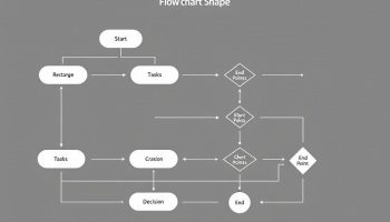
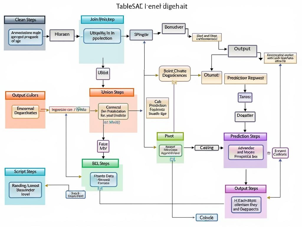
Anatomy of Tableau Prep Flow Charts
Tableau flow charts serve as visual roadmaps for your data preparation journey. These intuitive diagrams transform complex data workflows into easy-to-follow visual sequences, allowing you to see exactly how your data moves from raw input to polished output.
When working with Tableau Prep, you’ll encounter several essential step types that form the building blocks of your flow chart:
- Clean Steps: These powerful components let you transform and clean your data through operations like filtering, splitting fields, removing nulls, and standardizing formats. Your data quality improvements become instantly visible.
- Join/Union Steps: Combine data tables from different sources with drag-and-drop simplicity. The Tableau flow chart visually represents relationships between datasets, making complex joins more intuitive.
- Pivot and Aggregate Steps: Reshape your data structure by pivoting columns to rows (or vice versa) and creating summary calculations across multiple records.
- Script Steps: Integrate R or Python code directly into your flow chart, extending Tableau’s capabilities with custom transformations when needed.
- Prediction Steps: Apply Einstein Discovery models to generate predictions without leaving your Tableau flow chart environment.
- Output Steps: Define how and where your prepared data will be saved, whether to Tableau Data Extract, database, or CSV file.
Organizing Complex Flows
As your data preparation needs grow more sophisticated, you can maintain clarity in your Tableau flow chart through:
- Color-coding: Apply different colors to steps to indicate purpose or priority, making your flow chart easier to interpret at a glance.
- Annotations: Add descriptive notes directly to steps, providing context for future users and enhancing team collaboration on data projects.
- Grouping Steps: Organize related transformations into logical folders to reduce visual complexity in large flow charts.
- Connectors: The lines between steps show data movement and dependencies, helping you trace data lineage throughout your preparation process.
The Tableau flow chart structure enables both seasoned analysts and newcomers to understand data transformation logic without diving into code. This visual approach to data preparation not only makes processes more transparent but also creates efficient workflows that can be easily shared, audited, and modified as business requirements evolve.
By mastering Tableau Prep’s flow chart capabilities, you’ll transform not just your data, but your entire approach to data preparation—making it more visual, collaborative, and accessible across your organization.
Data Source Connections and Transformation Strategies
Creating effective tableau flow charts starts with establishing the right data source connections. You’ll find a wide range of connection options in the Connections pane, from databases and cloud storage to spreadsheets and local files. These connections form the foundation of your data preparation workflow, allowing you to bring together information from disparate sources into a cohesive analysis framework.
The Flow pane serves as your visual workspace for building data flow diagrams through an intuitive drag-and-drop interface. Each step in your tableau flow chart represents a specific transformation or data manipulation action. You can easily customize these sequences to match your specific data preparation needs.
Optimizing Flow Chart Structure
Maintaining logical progression is critical when designing tableau flow charts for data transformation. Consider these practices:
- Position input connections at the top
- Arrange transformation steps in sequential order
- Place output steps at the bottom
- Use consistent spacing between steps
- Group related transformations visually
The ability to reorder and reposition elements gives you complete control over your flow chart structure. This flexibility helps maintain clarity even as your data preparation processes become more complex. By thoughtfully organizing your tableau flow chart, you create a visual reference that clearly communicates your data’s journey from raw input to polished output.
Visual design elements enhance readability and comprehension of your tableau flow charts. You can implement color-coding to distinguish different types of transformations, add descriptive annotations to clarify complex steps, and use grouping to organize related operations. These visual cues transform technical data workflows into accessible documentation that supports both current analysis and future reference.
The power of tableau flow charts lies in their ability to visually represent complex data transformations while maintaining full technical functionality. This visual approach democratizes data preparation, making sophisticated processes accessible to team members with varying technical backgrounds while ensuring consistency in your data handling practices.

Chart Type Selection for Business Intelligence
Selecting the right chart type is crucial when building tableau flow chart visuals. You’ll find that different visualization formats serve distinct analytical purposes, making your data preparation more targeted and impactful.
When creating tableau flow charts, match your visualization to your specific business intelligence objectives. For comparison analysis, bar charts offer clear side-by-side assessment of values across categories. These charts work particularly well in tableau flow chart sequences where you need to highlight differences between data segments.
Spatial data requires map visualizations that integrate geographic information with your tableau flow chart processes. This combination allows you to track regional patterns while maintaining the visual data preparation workflow that makes tableau flow charts so valuable.
For data with temporal dimensions, incorporate line charts within your tableau flow chart structure. These effectively display trends over time and can serve as both inputs and outputs in your data transformation sequence.
Strategic Selection Based on Data Characteristics
The effectiveness of your tableau flow chart depends heavily on pairing visualization types with appropriate data characteristics:
- Relationship analysis benefits from scatterplots that reveal correlations between variables
- Part-to-whole comparisons work best with pie or treemap visualizations
- Hierarchical data structures require sunburst charts or treemaps
- Distribution patterns are best represented through histograms or box plots
- Network connections call for node diagrams integrated into your flow
Tableau flow charts transform complex data preparation processes by providing a visual project management flow chart for your analysis pipeline. When designing these flows, consider both the upstream data sources and downstream visualization needs.
The right chart selection enhances readability and makes your tableau flow chart more intuitive for stakeholders. This visual approach to data preparation significantly reduces the learning curve for new team members while providing effective project management tools for data professionals.
Remember that tableau flow charts should maintain visual consistency throughout the transformation process. Color-coding related elements and applying consistent formatting helps users track data as it moves through cleaning, joining, and aggregation steps.
By strategically selecting chart types that align with your analysis goals, you’ll create tableau flow charts that not only prepare data effectively but also communicate insights clearly to decision-makers.
Expert Insight: When designing Tableau flow charts, choose chart types that align with your specific analysis objectives to enhance clarity and effectiveness. For comparison tasks, utilize bar charts, while spatial data visualizations should be depicted through maps; for temporal analyses, line charts are ideal. Maintaining visual consistency through color-coding and formatting will further improve readability, empowering stakeholders to derive insights swiftly and accurately from the data.
Collaborative Data Preparation and Visualization
Tableau flow charts transform how your teams prepare data through visual collaboration. When team members can see the entire data transformation journey, they understand complex processes better and make faster decisions. These visual workflows create transparency that traditional data preparation methods simply can’t match.
You’ll find Tableau flow chart capabilities particularly valuable when working with cross-functional teams. Data analysts, business users, and IT stakeholders can all review the same visual representation, eliminating miscommunication about how data is being transformed. This collaborative approach strengthens project collaboration and builds confidence in data integrity.
Creating Reusable Data Pipelines
Tableau flow charts enable you to build transparent, reusable data preparation pipelines that serve as documentation and executable workflows. This dual functionality is crucial for scaling data operations across your organization. Your teams can:
- Share standardized data cleaning procedures through visual workflows
- Maintain consistent transformation logic across different datasets
- Collaborate on flow development with clear visibility of each processing step
- Reduce knowledge silos by making data preparation visible to all stakeholders
- Implement and track continuous improvement in data preparation routines
The reusability of Tableau flow charts dramatically reduces the time spent recreating common data preparation steps. Once you’ve built and validated a flow chart, it becomes a repeatable process that maintains consistency and quality standards. This approach helps eliminate redundant work and ensures your team applies best practices consistently.
A well-designed Tableau flow chart also serves as excellent documentation, showing exactly how raw data becomes analysis-ready information. The visual nature makes it easier for new team members to understand established data preparation processes, accelerating onboarding and reducing training time.
With Tableau flow chart capabilities, you can connect disparate data sources, perform complex transformations, and deliver consistent datasets that drive better business decisions. This visual approach to data preparation bridges the gap between technical and business users, creating a shared understanding that leads to more effective use of your organization’s data assets.
Implementing Tableau Flow Charts: Benefits and Next Steps
Tableau flow charts transform your data preparation workflow by providing visual representations of complex transformation processes. With tableau flow chart capabilities, you’ll streamline repetitive data tasks while maintaining full visibility into each transformation step. These intuitive diagrams connect data sources, cleaning operations, and output destinations in a cohesive visual format that both technical and non-technical stakeholders can understand.
Key Benefits of Using Tableau Flow Charts
When you implement tableau flow charts in your organization, you’ll experience several immediate advantages:
- Time savings through automation of repetitive data preparation tasks
- Enhanced data quality through consistent, replicable transformation processes
- Improved transparency with visual documentation of data lineage
- Reduced technical barriers that enable broader team participation
- Faster troubleshooting when data issues arise
- Simplified compliance documentation for data governance requirements
Tableau flow charts eliminate the frustration of dealing with disconnected data preparation steps. By creating a visual project management flow for your data, you’ll gain better control over the entire transformation process while reducing error risks.
The implementation process becomes more manageable when you start with these practical steps:
- Audit current data preparation workflows to identify bottlenecks
- Select a pilot project with moderate complexity
- Design your initial flow chart focusing on core transformations
- Test with sample data before scaling to production datasets
- Document the process and train team members on maintenance
For effective tableau flow chart implementation, you should establish clear naming conventions and organizational standards. Consider using color-coding to distinguish between different transformation types and add descriptive annotations to clarify complex steps.
When developing your tableau flow charts, balance complexity with clarity. While the tool can handle sophisticated data transformations, overly complicated charts may confuse users. Break larger workflows into logical segments and use folder organization for better navigation.
Don’t overlook project collaboration opportunities when working with flow charts. The visual nature of tableau flow charts makes them excellent tools for cross-functional discussions about data requirements and transformation logic.
Your implementation strategy should include regular reviews to optimize flow efficiency. Look for redundant steps, unnecessary transformations, or opportunities to use built-in functions rather than custom calculations.