Understanding Gantt and PERT Charts in Project Management
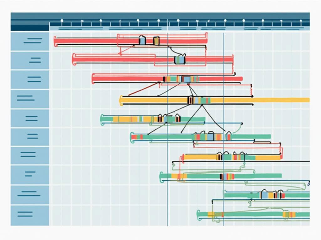
In project management, Gantt and PERT charts provide complementary visualization techniques that help you map, track, and optimize workflows. Gantt charts display intuitive timeline representations with horizontal bars showing task durations. PERT charts highlight task dependencies through network diagrams, giving your team powerful tools for planning and execution.
Key Takeaways
- Gantt charts offer clear visual timelines with horizontal bars representing task durations and progress.
- PERT charts specialize in mapping complex task relationships and dependencies.
- Each visualization technique serves different project management needs based on complexity and focus.
- Combining Gantt and PERT approaches can provide a comprehensive project management strategy.
- Modern project management tools increasingly integrate both methodologies for enhanced planning.
Both chart types have distinct advantages for project management. Research from the Project Management Institute shows that choosing the right visualization can significantly improve project outcomes. The selection depends on your specific needs – Gantt charts excel at timeline visualization while PERT charts focus on dependencies.
For optimal results, consider using these charts together. Many project managers find that Gantt charts simplify communication with stakeholders, while PERT charts help technical teams understand critical paths. Modern software solutions now combine features from both approaches.
Your team can benefit from learning both methodologies, as each provides unique insights into project structure. The ability to switch between timeline views and network diagrams allows for more adaptable project planning strategies across different phases of work.
“In the evolving realm of project management, Gantt and PERT charts serve as complementary allies, each illuminating distinct facets of complex workflows—Gantt charts with their straightforward timeline visuals and PERT charts with their intricate maps of task dependencies. By integrating both techniques, project managers can harness a powerful dual approach that drives strategic planning and execution to new heights.”
Understanding Gantt Charts
Gantt charts are horizontal bar charts that provide a clear visual representation of project schedules. Developed by Henry L. Gantt in the early 1900s, these charts have become essential tools for project managers who need to track timelines and monitor progress.
When comparing Gantt vs PERT charts, Gantt’s structure offers distinct advantages. Tasks are listed vertically along the left side while time intervals are displayed horizontally across the top. This layout creates an intuitive visual timeline that shows task duration, start and end dates, and current completion status.
The key features of Gantt charts make them particularly valuable for project implementation phases:
- Task visualization with horizontal bars representing duration
- Timeline tracking with clear start and end dates
- Progress monitoring through percentage completion indicators
- Resource allocation views showing team assignments
- Milestone markers highlighting critical achievements
Gantt charts excel in providing user-friendly timeline tracking. You can quickly identify which tasks are running behind schedule and adjust your resources accordingly. Their flexible scheduling capabilities allow for easy updates when project parameters change, which is crucial when managing project constraints and dependencies.
Strengths and Limitations
Gantt charts offer significant strengths that explain their popularity in Gantt vs PERT discussions:
- Intuitive visual representation that’s easy for stakeholders to understand
- Clear display of task sequences and durations
- Ability to track actual progress against planned timelines
- Simple identification of resource conflicts and availability
However, these charts also have limitations you should consider:
- They can become unwieldy for very large projects with hundreds of tasks
- Complex interdependencies between tasks aren’t always clearly visualized
- The focus on scheduling sometimes overshadows critical path analysis
- They don’t inherently account for probability or risk in time estimates
When deciding between Gantt vs PERT methodologies, consider your project’s complexity and dependency requirements. While Gantt charts provide excellent schedule visualization, they may need supplementation with other tools for complex projects requiring detailed dependency mapping and probabilistic time estimates.
Gantt charts are valued by project managers, with 77% of successful projects using them to track progress and schedule tasks efficiently.
forbes.com
Understanding PERT Charts
PERT charts, or Program Evaluation and Review Technique charts, revolutionized project management when the U.S. Navy created them in the 1950s. Unlike traditional scheduling methods, PERT charts focus primarily on mapping task relationships and dependencies within a project network diagram. When comparing Gantt vs PERT approaches, you’ll notice fundamental differences in how they visualize project information.
PERT charts excel at displaying the complex relationships between tasks. Each activity appears as a node (typically a box or circle) with connecting arrows showing dependencies and workflow sequence. This network-based approach helps you identify critical paths—sequences of tasks that directly impact your project’s completion date—with remarkable clarity.
Key PERT Chart Features
PERT charts bring several valuable capabilities to your project management toolkit:
- Time estimation flexibility: PERT uses three time estimates (optimistic, most likely, pessimistic) to calculate expected completion times, helping account for uncertainty.
- Dependency visualization: Clearly shows which tasks depend on others completing first.
- Critical path identification: Highlights the sequence of tasks that determines your project’s minimum duration.
- What-if scenario planning: Allows you to test different approaches through detailed network analysis.
The statistical foundation of PERT charts makes them particularly valuable for effective risk response planning in complex projects. However, these charts require more effort to create than their Gantt counterparts and can sometimes suffer from subjective time estimates.
When deciding between Gantt vs PERT visualization, consider your project’s complexity. PERT charts shine in projects with numerous interdependencies where understanding relationships between tasks is crucial for executing your projects successfully. While Gantt charts provide straightforward timeline views, PERT charts offer deeper insight into how tasks interact with each other.
The following table summarizes key differences between Gantt vs PERT approaches:
| Feature | PERT Charts | Gantt Charts |
|---|---|---|
| Visual Format | Network diagram with nodes and arrows | Horizontal bar chart |
| Primary Focus | Task dependencies and relationships | Timeline and duration |
| Time Estimates | Three-point estimation (statistical) | Single duration estimate |
| Best For | Complex projects with many dependencies | Timeline visualization and tracking |
| Weakness | Labor-intensive to create and maintain | Limited dependency visualization |
Many project managers find that combining both visualization techniques provides the most comprehensive view of projects. PERT charts help with initial planning and identifying critical paths, while Gantt charts track progress through implementation phases.
Expert Insight: To harness the full potential of PERT charts in project management, focus on the detailed visualization of task dependencies and relationships, as this can illuminate the critical paths essential for timely project completion. Utilize the three-point time estimation feature to account for uncertainties, allowing for more accurate planning and resource allocation. Finally, consider integrating PERT charts with Gantt charts for a comprehensive overview that balances in-depth analysis with progress tracking, optimizing your project outcomes.
Comparative Analysis
When comparing Gantt vs PERT charts, you’ll find distinct differences in how they visualize project information and the situations where each excels. These project management tools serve complementary purposes but approach visualization from different angles.
The fundamental contrast between Gantt vs PERT charts lies in their visual structure. Gantt charts display tasks as horizontal bars on a timeline, making them ideal for schedule-focused planning. PERT charts use network diagrams with nodes and arrows to emphasize task relationships and dependencies.
Let’s examine how Gantt vs PERT charts compare across key project management dimensions:
Key Differences: Gantt vs PERT
These visualization tools differ in several important aspects that impact their application in project management:
| Feature | Gantt Chart | Pert Chart |
|---|---|---|
| Primary Focus | Schedule and timeline | Task relationships and dependencies |
| Visualization Type | Horizontal bar chart | Network diagram with nodes |
| Time Representation | Fixed durations | Probabilistic (optimistic, pessimistic, most likely) |
| Complexity Level | Simpler for small projects | Better for complex dependencies |
| Critical Path | Limited visibility | Clearly identifies critical path |
| Progress Tracking | Visual percentage complete | Network-based milestone tracking |
| Uncertainty Handling | Limited | Built-in through three-point estimates |
The choice between Gantt vs PERT often depends on your project’s complexity and focus. For straightforward projects with clear timelines, a Gantt chart provides sufficient visualization. Complex projects with intricate dependencies benefit from PERT‘s network approach.
You’ll find Gantt charts most valuable when:
- Communicating timelines to stakeholders
- Tracking actual progress against planned schedules
- Managing resources across multiple simultaneous tasks
- Maintaining a clear overview of project timing
PERT charts deliver the greatest benefits when:
- Mapping complex task interdependencies
- Identifying the critical path that determines project duration
- Analyzing how delays impact downstream activities
- Planning effective risk responses through multiple time scenarios
Many successful project managers integrate both Gantt vs PERT methodologies, using PERT charts during initial planning to establish dependencies and identify critical paths, then transitioning to Gantt charts for day-to-day execution tracking.
By understanding the differences between Gantt vs PERT approaches, you can select the right visualization tool for each project phase, enhancing your ability to plan effectively, communicate clearly, and execute projects successfully.
Expert Insight: When conducting a comparative analysis of Gantt vs PERT charts, focus on their distinct strengths: Gantt charts excel in scheduling and timeline visualization, making them ideal for straightforward projects, while PERT charts shine in managing complex task relationships and dependencies. Leverage Gantt charts for resource management and progress tracking, and utilize PERT for identifying critical paths and mapping interdependencies during the planning phase. By integrating both tools at different project stages, you enhance your planning efficiency and ensure effective communication, ultimately leading to successful project execution.
Strategic Implementation
Your choice between Gantt vs PERT charts significantly impacts project outcomes. Making the right selection requires understanding when each visualization tool delivers maximum benefit for your specific project needs.
When to Use Each Chart Type
Gantt charts excel in projects with well-defined timelines and straightforward task sequences. They’re particularly effective for:
- Projects with predictable timeframes and minimal uncertainty
- Stakeholder communication requiring timeline visibility
- Resource allocation across multiple projects
- Tracking actual progress against planned schedules
- Implementation phases requiring clear milestone tracking
PERT charts offer superior value when managing complex projects with numerous interdependencies. Consider PERT for:
- Projects with significant uncertainty in task duration
- Complex initiatives requiring detailed dependency analysis
- Critical path identification in large-scale projects
- Statistical time analysis using optimistic, pessimistic, and most likely estimates
- Risk assessment through probabilistic scheduling approaches
The following table highlights key selection factors when choosing between these visualization tools:
| Factor | Gantt Chart | PERT Chart |
|---|---|---|
| Project Complexity | Low to Medium | Medium to High |
| Focus | Timeline and Schedule | Dependencies and Relationships |
| Time Estimation | Single-point | Three-point (O/M/P) |
| Learning Curve | Shallow | Steeper |
| Risk Analysis | Limited | Comprehensive |
Integrating both methodologies often provides the most comprehensive project communication framework. Start with PERT during planning phases to map dependencies and identify the critical path. Then transition to Gantt for day-to-day execution tracking and stakeholder updates. This combined approach helps minimize cost overruns through better planning and execution control.
Modern project management software typically supports both Gantt vs PERT functionality. Leading solutions enable dynamic switching between views, allowing you to leverage the strengths of each visualization method throughout different project phases. When selecting tools, prioritize those offering customizable templates and automated critical path calculation to enhance your strategic planning capabilities.
For complex initiatives, consider how both chart types support risk management. While Gantt provides schedule variance visibility, PERT’s probabilistic approach helps quantify potential delays through its three-point estimation methodology. This dual perspective creates a more robust risk response planning framework.
Projects with clear strategic implementation show a 28% increase in success rates, emphasizing the importance of choosing the right project management tools.
forbes.com
Practical Applications and Future Trends
You’ll find Gantt vs PERT charts applied across various industries today, with each visualization method serving distinct project needs. Construction projects often rely on Gantt charts to track tangible progress against timelines, while aerospace and defense sectors favor PERT for complex interdependencies and risk analysis.
Software development teams frequently switch between both tools—using Gantt charts during sprint planning and PERT analysis for architectural dependencies. Healthcare implementation projects benefit from PERT‘s ability to handle uncertain timelines, particularly in clinical trials where Gantt vs PERT considerations are crucial for resource allocation.
Emerging Visualization Technologies
The future of project visualization is evolving beyond traditional Gantt vs PERT approaches. Consider these emerging trends:
- AI-enhanced scheduling tools that automatically adjust timelines based on historical performance data
- Augmented reality interfaces allowing teams to “walk through” Gantt vs PERT charts in virtual spaces
- Machine learning algorithms that predict potential schedule conflicts before they occur
- Blockchain integration for immutable project milestone verification
Modern project delivery frameworks increasingly incorporate hybrid approaches that blend Gantt vs PERT methodologies. Cloud-based collaboration platforms now offer real-time updates across global teams, addressing one of the traditional weaknesses of PERT charts.
The integration of predictive analytics helps you avoid cost overruns by identifying potential schedule slippages early. When selecting visualization tools, consider how they’ll support your specific project communication needs.
| Industry | Gantt Usage | Pert Usage |
|---|---|---|
| Construction | Timeline tracking, resource allocation | Critical path analysis for complex builds |
| IT/Software | Sprint planning, release management | System architecture dependencies |
| Manufacturing | Production scheduling, capacity planning | Supply chain risk analysis |
| Event Planning | Day-of timeline coordination | Contingency planning |
| Research | Milestone tracking | Experiment interdependencies |
Effective strategic planning now requires fluency with both Gantt vs PERT methodologies. The distinction between them continues to blur as software platforms incorporate features from both approaches, creating unified visualization tools that serve multiple project management needs.